COVID-19 Beta
In this short post, we compute and visualise “COVID-19 betas” for stocks in the S&P500 index, to quantitatively and visually understand which companies were most affected (positively and negatively) by COVID-19.
For those of you who just want to see the (interactive!) result, here it is. Click on any sector to zoom in on its constituents:
If you would like to generate this plot for yourself, perhaps using a different basket of stocks, the Jupyter notebook is here.
Note: most of this post was written before November 9th 2020, the day on which Pfizer announced incredibly encouraging results regarding their vaccine.
Motivation
Let’s go back in time to the start of 2020. Despite aggressive trade rhetoric, 2019 has been a great year for markets, with the S&P500 up about 30%. Thanks to low rates (and the Fed’s commitment to loose monetary policy), the “blip” of 2018Q4 is nothing more than a distant bad dream. Big tech is killing it; multiples are expanding; volatility is at a comfortable low.
On January 4th, the World Health Organisation (WHO) tweets that there is a cluster of pneumonia cases in Wuhan, China. As far as the West is concerned, this is a non-event, happening way “over there” in the East. On January 13th, a case is recorded in Thailand. What follows is two months of health officials gathering and mulling over the evidence (on January 23rd an independent committee reports that there is insufficient evidence to make a decision), while the rest of the world continues on blissfully unaware of the worsening situation. The markets continue their steady rise, largely unperturbed.
In February, the situation becomes hard to ignore; by February 13th, COVID-19 is present in 25 countries, with more than 60,000 cases (source). On the 14th of February, market participants suddenly seem to appreciate the gravity of the situation; in one short month, the S&P500 loses 1/3 of its value. People who have been diligently following the prevailing personal finance advice and investing their money in the stock markets are suddenly faced with an unprecedentedly rapid loss of net worth. Speculators, who have been riding the rally with leverage, are caught with their trousers down.
By March, there is full-on panic as the worldwide number of cases hits 100,000 and nations start to impose heavy travel restrictions. What had started as whispers of a viral cough “far away in the East” has now blown up into the terrifying spectre of an omnipresent contagion – $R_0$ numbers suggest that before long, the majority of the world population will be infected by a virus whose severity is still unknown. Readers of mainstream news could be forgiven for thinking that it is the end of the world as we know it.
Cut to 18th August – 6 months later. The S&P500 has just posted a new all-time high, having appreciated about 50% from the low of March 20th.
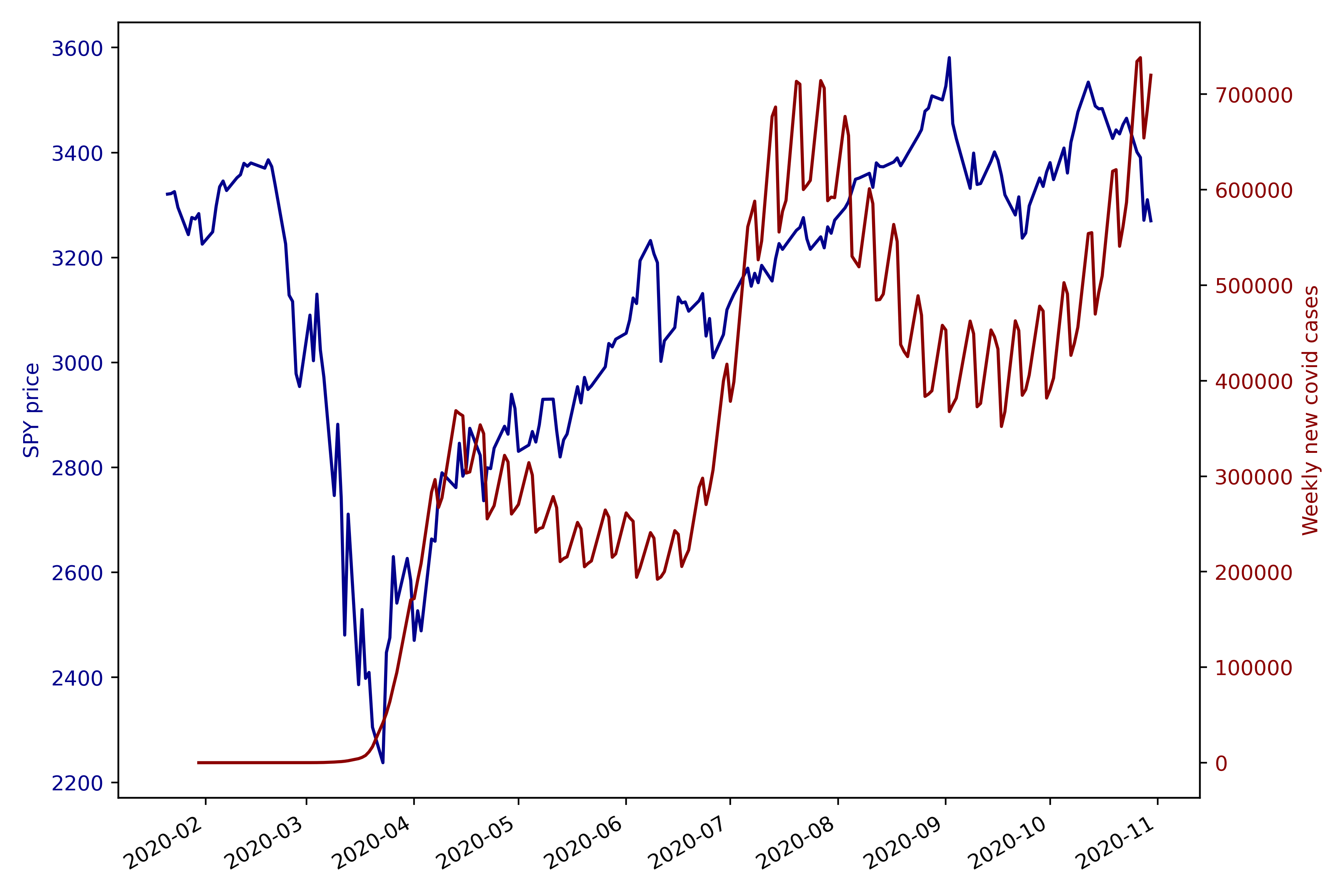
I have written this dramatised account largely as a note-to-self. With the rose-tinted spectacles of hindsight, it is now clear that the widespread and indiscriminate risk-off in March created a fantastic opportunity for level-headed investors to pick up high-quality companies, well suited to a social-distanced society, at steep discounts. Many of us are now kicking ourselves for not having bought more, but we must remember that in the moment, the future was murky indeed.
All this said, things certainly aren’t back to where they were. Only a handful of companies (mostly big tech) have been responsible for the majority of the market’s rebound. Whether you are optimistic or pessimistic about how the pandemic plays out from here, as long as you think COVID-19 is a key driver for stock markets it is important to know how different sectors or companies are affected by the virus. Optimists might be keen to identify which stocks have been hardest hit, to play the rebound, while those who think that the situation will stay unresolved for longer than consensus expects may want to remain overweight the companies that thrive in a pandemic environment.
The goal of this investigation, therefore, is to develop a highly intuitive tool to allow the viewer to understand, at a glance, which companies respond well and badly to COVID-19 news.
Methodology
The standard approach is “armchair reasoning”: sitting down and logically thinking through what the impacts of COVID-19 have been / will be. On April 2nd 2020, I made this brainstorming mindmap to reason about some of the second-order implications of the pandemic. Several of the companies I mentioned, which may seem obvious in hindsight, have done very well:

Alternatively, we might adopt the “data-driven” approach: let market performance tell you which stocks benefitted most and least from COVID-19. Naively, we could simply look at which stocks/sectors have performed best/worst this year. This is a reasonable starting point but contains a lot of noise because stocks move up and down for all sorts of reasons.
A better methodology for understanding how some factor (in our case, COVID-19) affects stock prices is is to compute the beta of the asset returns to the factor. Concretely, we examine the correlation between the daily change in stock prices and the daily increases in COVID-19 cases: if a stock tends to have negative returns whenever COVID cases rise, we may believe that there is some association between COVID and the stock. The nice thing about this approach is that we can remove the effects of as many other variables as we want by introducing them as additional regression variables.
In this post, we will regress stock returns against both COVID-19 cases and the overall S&P500 index (the latter being what people typically call the beta, though it is really just a beta). This serves to identify the effect of COVID-19 on the stock in excess of the overall market effects, which should give a more accurate picture of how COVID-19 is affecting a stock.
I pulled COVID data from the New York Times’ GitHub repo, and as usual, I used Yahoo Finance (via the yfinance python library) for stock/index pricing data. The “heavy lifting” – regressing stock returns against SPY returns and the change in daily cases – was done by the linear regression class within scikit-learn.
Analysis and Visualisation
A higher COVID beta means that a stock’s returns were positively correlated with the change in COVID cases, i.e. more COVID cases helped the stock. Perhaps unsurprisingly, among the stocks with the highest COVID betas were Netflix, Walmart, Hasbro, Intel, and Citrix (enterprise technology). Conversely, the stocks with the most negative COVID betas include hard-hit companies in the energy and consumer discretionary sectors. This is encouraging, as our methodology passes the basic sanity check. Tech companies like Netflix were clear winners from national lockdowns, while energy companies faced a massive demand shock as people no longer drove to work or travelled overseas.
To summarise the betas in one clear diagram, I drew inspiration from the Bloomberg terminal heatmap, which gives an instant “pulse” of the market with respect to one key variable (with the size of a rectangle representing market caps):
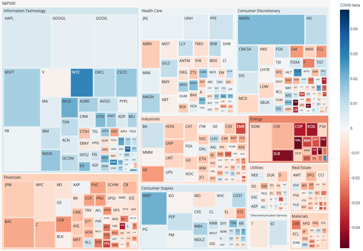
(Note: we don’t see a large blue rectangle corresponding to Zoom because Zoom isn’t yet in the S&P500 index)
At a first glance, this graphic seems to accurately describe much of our intuition regarding what COVID has benefitted/harmed. Tech is largely blue (benefitting), as are healthcare and consumer staples. Energy has been particularly hard hit, with financials having a tough time also. But the effect of COVID on other sectors may not be as obvious, and it is here where the visualisation becomes especially helpful.
Note regarding the Pfizer news of November 9th 2020
On 9 November, while I was halfway through writing this post, Pfizer announced very promising results from their vaccine. I found the heatmap to be a very useful reference – the red companies/sectors posted stunning returns, while many of the blue companies (e.g. big tech) had a lacklustre day – and actually ended up using the heatmap to help identify some stocks to trade. Based on my qualitative judgment post-hoc, the betas on the heatmap do seem to properly reflect the economic link between COVID-19 and the companies.
Conclusion
In this post, we have constructed a “quick and dirty” method of understanding and visualising the effects of COVID-19 on different companies. There are several important caveats which should be considered before you use the heatmap for anything important.
Firstly, betas are essentially correlations, so we must be careful about using them to retroactively create narratives to explain why certain stocks did well/badly with respect to COVID-19. One must exercise judgment in determining which betas represent broad economic impacts due to COVID-19, rather than idiosyncratic company effects. For example, I noticed that within the financials sector, Goldman Sachs stood out as having a positive COVID beta – I reasoned that this was because GS doesn’t have significant commercial banking exposure, instead being focused on trading (which benefits from volatility) and investment banking. However, this narrative is somewhat contradicted by the fact that Morgan Stanley also lacks commercial banking exposure, yet had a negative COVID beta anyway.
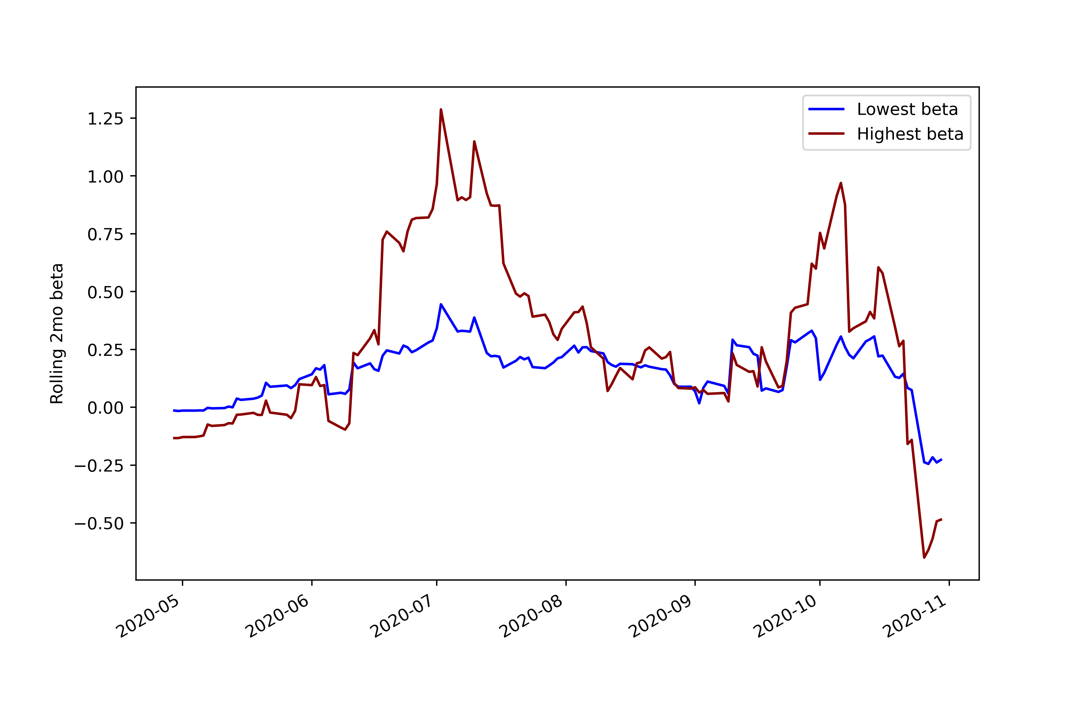
Secondly, this analysis treats beta as if it is a static parameter. In reality, to compute beta (or any other time-series property), one must decide on a rolling window for the calculation. In this post, we used all year-to-date stock price data, but the plot below shows how the 2-month rolling beta for the 10 highest/lowest beta stocks (averaged) varied over time.
Lastly, we have all likely heard the many complaints about the market diverging from reality, along with the standard response that “markets are forward-looking”. Our methodology is not at all forward-looking, as it is simply regressing returns against the daily change in cases. A more meaningful calculation would be to calculate the beta with respect to some estimate of future COVID cases – possibly the beta to $R_0$.
These issues aside, I have personally found the heatmap to be a useful visualisation tool; at the very least, the plot is somewhat pleasant to look at and play around with.