The Big Shorts: what is the smart money betting against?
Hedge funds in the UK are legally obligated to disclose to the Financial Conduct Authority (FCA) whenever their net short position in a particular listed company reaches 0.5% of the issued equity capital. In this post, I investigate a publicly available dataset containing information about these large institutional short positions in UK equities and attempt to understand the value that this data contains.
This is a true data science project, in that the main difficulties I had were not so much related to the analysis (there is no machine learning involved), but rather the cleaning and preprocessing of data. Usually when I write posts like this, I explain the code as I go along, but today I’m experimenting with a new format aimed at readers who are more interested in the actual outcomes of the analysis rather than the process. To that end, I have put all of the code (with brief explanations) in an accompanying Jupyter notebook; this post will focus on the motivation and results of the investigation, rather than the methods.
Short selling
A short sale is a relatively simple transaction in which you borrow shares of a company, then immediately sell them. If the share price drops, you can buy them back at a cheaper price, return them to the lender, and pocket the difference. Rather than buying low and selling high, shorting is equivalent to selling high and buying low. This simplicity notwithstanding, shorting is often associated with more experienced investors. One reason could be that short selling has a theoretically unlimited downside – if you shorted Tesla at \$300 a share and covered at \$800, you would be out of pocket by \$500, whereas if you bought at \$300 and it went to zero, you would only be out of pocket by the \$300 you put in.
Short selling is often demonised in the media, construed to be one of the many evil things that hedge funds get up to at the cost of society. However, there are many good reasons why you may want to bet against a company; the famous short-seller Jim Chanos aggressively shorted Enron in the lead up to its collapse in 2001 (and more recently, Luckin Coffee prior to its accounting scandal). Furthermore, it is not possible for short selling in and of itself to cause a company’s equity value to collapse because of the uptick rule (a stock can only be shorted after it ticks up). I am of the belief that short selling is an important market mechanism which may help to counteract the “irrational exuberance” that often plagues markets; it is fundamentally no better or worse morally than buying a stock. In both cases, capital is allocated based on your views of future performance.
The significance of the FCA dataset
As stated in the introduction, the Financial Conduct Authority in the UK mandates that investors disclose short positions exceeding 0.5% of a given public company’s float. These disclosures make for a fascinating dataset because hedge funds tend to be notoriously secretive about their positions since disclosing positions (long or short) may allow competitors to cotton-on to the fund’s strategy and accelerate alpha decay. In the case of short selling, there is an added dimension: disclosure leaves a fund susceptible to targeted short squeezes, in which other market participants start to buy up shares, driving up the price and sometimes forcing short-sellers to cover their positions at a loss (further driving up the price).
Nevertheless, because of the FCA, we can get a rare glimpse into the holdings of the smartest players in the industry. Furthermore, the FCA additionally requires that once companies are above the 0.5% mark, they must disclose any changes in their position of more than 0.1%. Hence we not only know whether an institution has a large position but also how they are modifying their position in response to external factors.
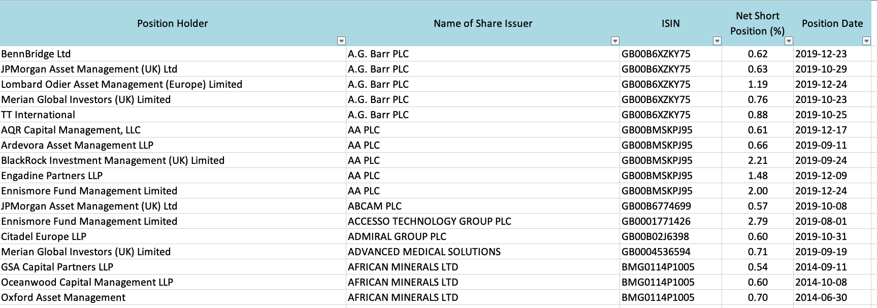
The dataset, which updates every day, can be downloaded from the FCA website. This is what the top of the dataset looks like:
With this in mind, the main hypothesis that this post will be investigating is as follows: companies with a lot of institutional short interest (i.e companies for which many smart players are shorting the stock) should be more likely to experience a decline in the share price.
Data cleaning and exploration
One problem with the FCA dataset is that it gives the company names and International Securities Identification Number (ISIN) rather than symbols like AAPL or TSLA. ISINs are “better” in the sense that they uniquely identify securities (symbols are not unique across different exchanges), but the difficulty is that most of the free data providers only let you query historical data by symbol. I had to write a web scraper to convert the ISINs to tickers, which was a real pain, but it allowed me to download historical prices for most of the present securities.
Having done the dirty work, I was able to start exploring various aspects of the data. I started by looking for the most active investment, which turned out to be Marshall Wace’s position in Sainsbury’s (at one point, the net short position was 2% of the float, more than £100 million). The plot below shows the net percentage short position (green) against the rescaled price (blue).

The flat regions for the short position are expected because below 0.5% Marshall Wace does not have to disclose anything. This plot is rather interesting because the big spikes in the short position do not seem to be associated with decreases in the stock price (a statement that will be refined later on).
Next, I was interested to find out which investors were most active in short selling:

To get a rough indicator for the most shorted stocks, I took the mean short position in a given stock across each investor, then summed these over the time frame. By this measure, the most-shorted stock was Ocado, the UK grocery delivery company.
Next, to start exploring the hypothesis, I plotted the 1-day forward returns against the short position (naively, without grouping by investor or ticker). If the hypothesis were true, we would expect a general downward-sloping pattern (larger short position means lower returns).

Eyeballing it, there does not seem to be any meaningful relationship. The Spearman rank correlation coefficient (also known as the information coefficient) can be used to quantify this – I found that there were only statistically significant correlations across the longer time horizons. Perhaps more interestingly, the sign of the correlation was positive ($r \approx 0.015$). This means that short positions are correlated with future price appreciation, the opposite of what was hypothesised.
Intelligent short interest as a trading signal
The above analysis is very crude because it does not perform any grouping. To improve it, I aggregated the net short position in each stock across all investors for each given date, which I will henceforth refer to as the “intelligent short interest” since it is the short interest from large investors who we hypothesise to be knowledgeable.
We can then use the wonderful Alphalens library, built by Quantopian, to properly evaluate the predictive capability of this feature. One particularly useful tool is the quantile analysis, which evaluates the performance of different feature quantiles (e.g. high/median/low values of the short interest). For example, if the intelligent short interest were indeed predictive of negative returns, we would expect the 20% of assets with the highest intelligent short interest to do much worse than the 20% of assets with the lowest intelligent short interest. Using 5 quantiles, we can look at the information coefficients (read: Spearman correlation coefficients) to understand the predictive value of the feature:

This tells us a slightly different story to the initial analysis. There are indeed statistically significant negative correlations between the intelligent short interest and the future return, although the signal isn’t particularly strong. An especially damning plot is the mean forward return for each quantile:
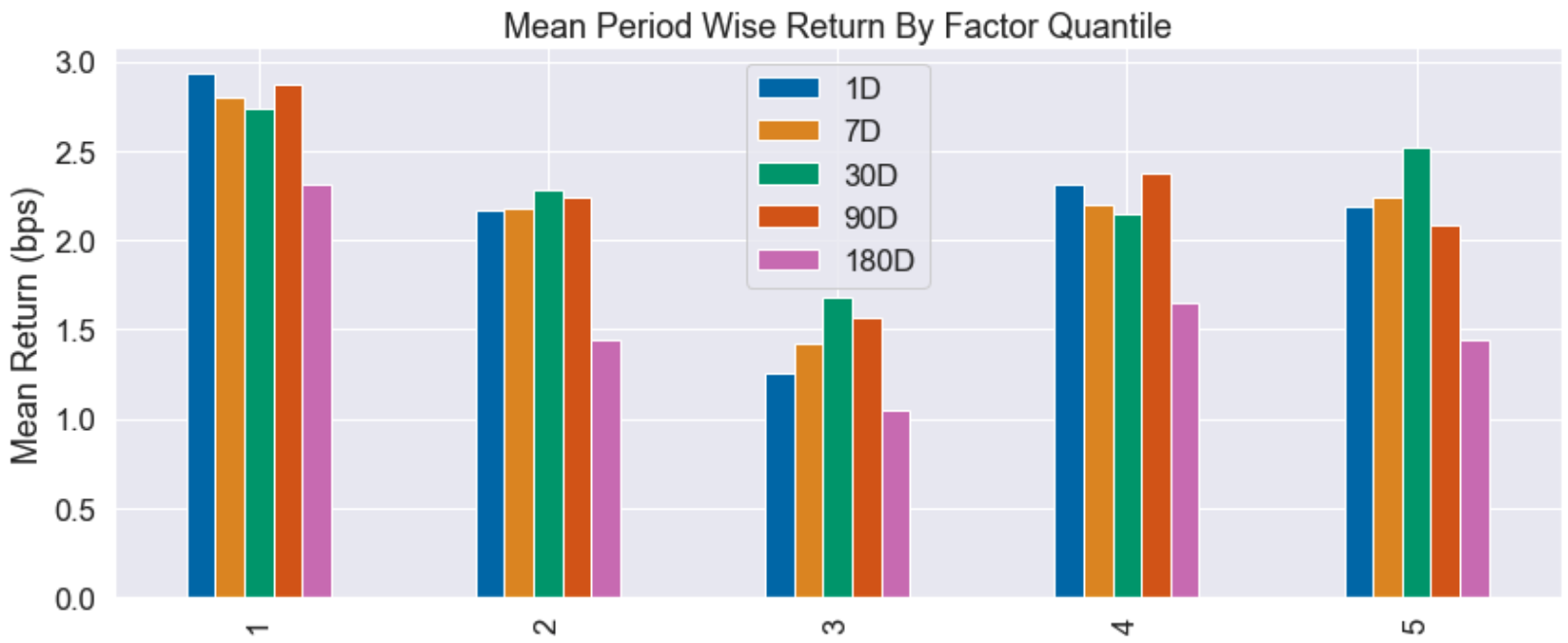
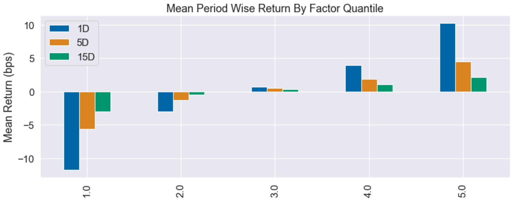
Colourful though the plot may be, it’s pretty terrible from a signal perspective. It is telling us that regardless of which quintile we are in (low vs high short interest), forward returns are positive and there is no clear pattern. By contrast, below I have attached a quantile plot for another trading signal I have been researching, which shows excellent discriminatory power between the extreme quantiles:
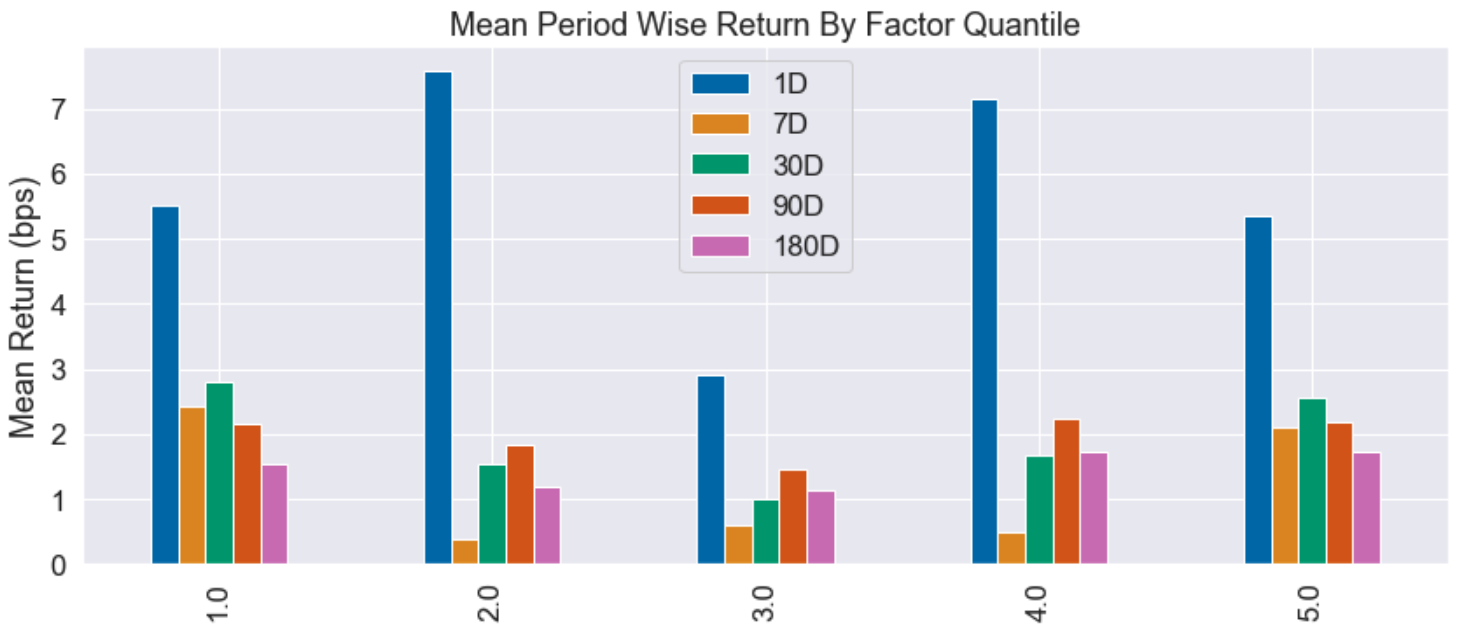
I wasn’t ready to give up just yet – sometimes, a bit of feature engineering can be used to bring life to a seemingly useless signal. Rather than looking at the absolute intelligent short interest, I thought it might be interesting to consider the change in the intelligent short interest, with the hypothesis that an increase in the intelligent short interest is predictive of negative future returns. In fact, this signal was even worse than the absolute intelligent short interest:
In summary, the results of this section are mixed at best. Based on the statistical significance of the information coefficient (even after applying a Bonferroni correction to account for multiple comparisons), we would conclude that the hypothesis is correct – formally, that there is sufficient evidence at the 1% level to reject the null hypothesis that there is no correlation between the intelligent short interest and the future returns. However, statistical jargon aside, the predictive power is rather weak and the quantile plots are a clear indication that the intelligent short interest is not going to be a useful trading signal.
The smartest smart money
This section is a slight detour from the hypothesis about the predictive power of the dataset. I noticed that in principle we had enough data to evaluate the performance of different investors, using the time-weighted rate of return (TWRR). The result of this calculation is tabulated; here is a segment of it:
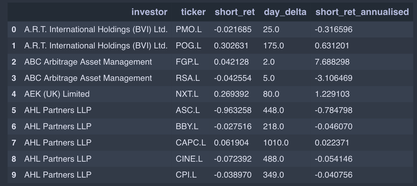
This is interpreted as follows: AHL Partners was involved in shorting ASOS (ASC.L) over a period of 448 days in total, during which time its overall TWRR on the position was -96%. Of course, this is only based on the time during which AHL’s position was more than 0.5% of ASOS’s float, so this TWRR will not be perfectly accurate.
The performance data was further cleaned to exclude total involvement periods of less than a year since I am more interested in identifying which managers are consistently making positive returns with their large short positions. A histogram of the annualised short returns is shown below:

The distribution itself is quite interesting, displaying long tails (longer on the left) and a sharp peak – note that returns can be more than -100% because we are dealing with the TWRR. The summary statistics paint a richer picture:
| Statistic | Value |
|---|---|
| Mean | -0.8% |
| Median | -5.0% |
| Skew | -0.02 |
| Kurtosis | 85.9 |
The high kurtosis means that the distribution has much fatter tails than a normal distribution, suggesting that the “outliers” are quite important, while the negative skew implies that the left tail is longer. However, the thing that jumped out at me was the huge difference between the median and the mean. The median short investment returns an annualised -5%, while the mean returns about 0%. This suggests that there is a small group of investments massively pulling up the average.
We can go one step further – rather than just evaluating the performance of investments, we can look at the performance of investors. To do this, I used a simple aggregation procedure, taking the investor’s mean return across all positions. This is certainly not the best way of doing things because it assumes that the shorts are all of equal value. The dataset actually contains enough information for us to calculate the value of each investor’s shorts, and come up with a dollar performance. Nevertheless, proceeding with the simplified analysis, the histogram of each investor’s average performance is shown below:

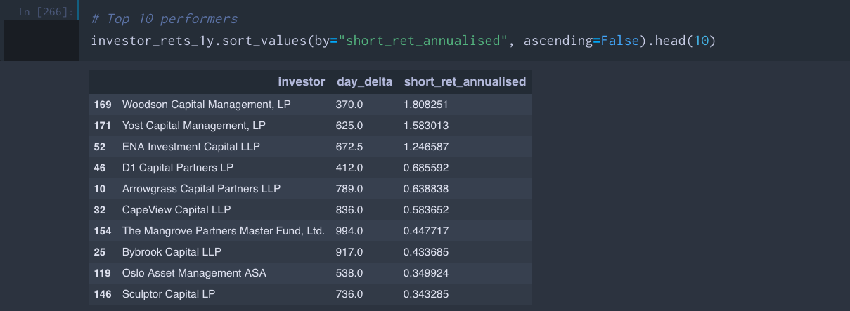
This provides evidence that it is not just a small group of investments pulling up the average, it is a small group of investors. The top 10 investors, their average period of involvement, and their annualised return on the large short positions are as follows:
Out of courtesy I will not name and shame the bottom 10, but they can be found in the Jupyter notebook if you’re curious. I was surprised to see many big names, but in retrospect, because this analysis does not take into account dollar returns, the playing field is tilted in favour of the smaller players.
Lastly, we can try to get some sense of the different investment styles (and their relative successes) by plotting both the average annualised TWRRs and the average involvement period. The size of the points is proportional to the number of different companies being shorted (a good proxy for the assets under management of the investor), while darker colours correspond to higher frequencies.

The plot can be used to comment that, for example, although D1 Capital Partners and Arrowgrass Capital Partners both have a similar annualised return of about 65%, D1’s investment style involves much shorter involvement periods with a given company. Unsurprisingly, it is also seen that the larger players also trade with higher frequency.
Conclusion
In conclusion, the short disclosure dataset is almost certainly not a basis for a simple copycat strategy. Although the net intelligent short interest has a statistically significant negative correlation with future returns (over time horizons of more than a month), the predictive power is weak, highlighted by the quantile plot. This may seem strange – the hypothesis was grounded on the reasonable assumption that the bets of hedge funds, who we consider to be the “smart money”, would be pretty good predictors of future returns.
However, we must remember that this dataset only represents half of the story. Hedge funds (the clue is in the name) often hedge their long positions with shorts. These shorts may not be expected to have positive returns when the overall market is going up, as long as they outperform when the market is going down. In particular, a common strategy for large players like Marshall Wace is the long/short basket strategy, in which you go long a large group of companies and short another group, based on some ranking methodology. In this case, you almost expect most of your shorts (and longs) to do badly – it is the law of large numbers that results in a net profit.
Another possible explanation for the weak predictive effect is short squeezes, in which an initial small increase in prices can result in a positive-feedback loop of liquidation as investors cover their positions.
Despite the mixed results, this kind of analysis may provide a useful datapoint for discretionary equity portfolio managers because it shines light onto the landscape of marginal buyers/sellers. For example, if you see that a certain fund holds a large short position in a small company, you know that at some point in future there might be significant demand for the shares as the fund seeks to close its short position.
We have also drawn some other interesting insights from the dataset, for example, the fact that a small group of investors seem to be pulling up the average. This could be an area for further investigation – rather than blindly copying from the person sitting next to you, it might make sense to first identify who the smartest person in the classroom and copy from them.